New identity for Endeev
![]()
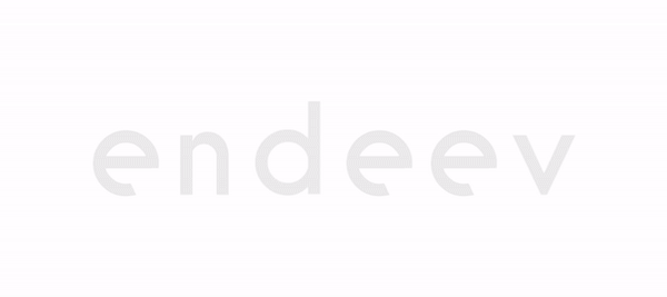
After a whole year of changes and growth, our company logo needed a refresh.
We decided to simplify our logo, still using our representative sans-serif typeface, but making it look a lot more modern and playful.
![]()
We added positive tracking, making the wordmark more distinct, easier to read and good looking on small screens and sizes.
The new wordmark has been colored with the current company colors, black, teal green and light blue. The colors are softer than they used to be, but they maintain the chromatic range.
Two twisted letters (double e) accessorized the whole look and feel.
The angle of the slanted “e’s” was added to grant fun to the company identity. At Endeev we want to transform our name into a verb. Spread our culture to our clients and pairs, presenting ourselves as an unconventional company, a brand that people think of as being playful/cool/fun/creative.
Our new logotype is set in a custom, geometric sans-serif typeface, maintaining the multi-colored playfulness and adding the rotated ‘e’s’ — a reminder that we’ll always be a bit unconventional.